
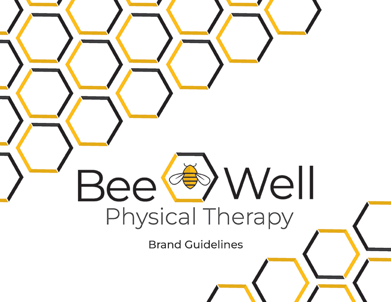
Bee Well Physical Therapy
Branding | Logo Identity and Website
Bee Well Physical Therapy is a Physical Therapy Clinic located in Medina, Ohio’s Main Square, where Honeybees are a strong motif. Bee Well provides the highest quality one-on-one care to get what you love. The logo is unique to Bee Well Physical Therapy and all its branding. This logo combines honeybees and honeycombs to develop the overall look and feel of the brand. The brand includes logo guidelines, business and appointment cards, and a website.
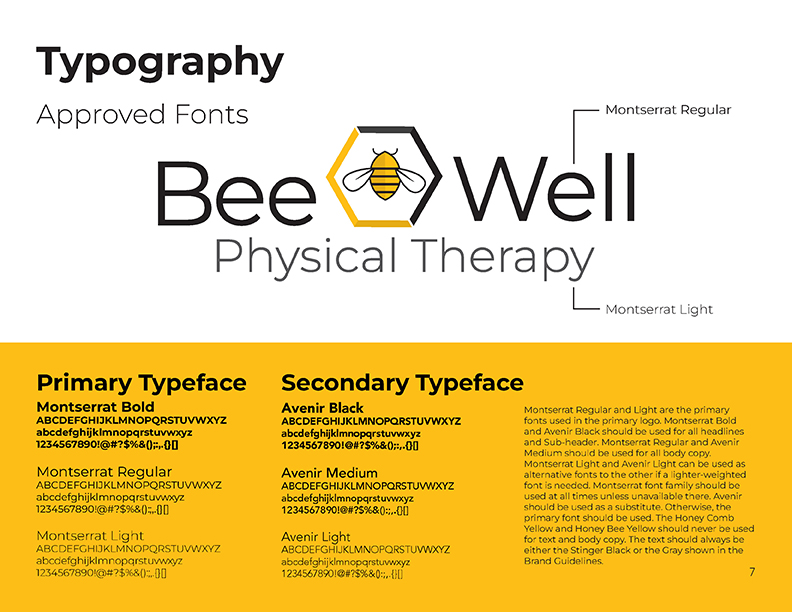
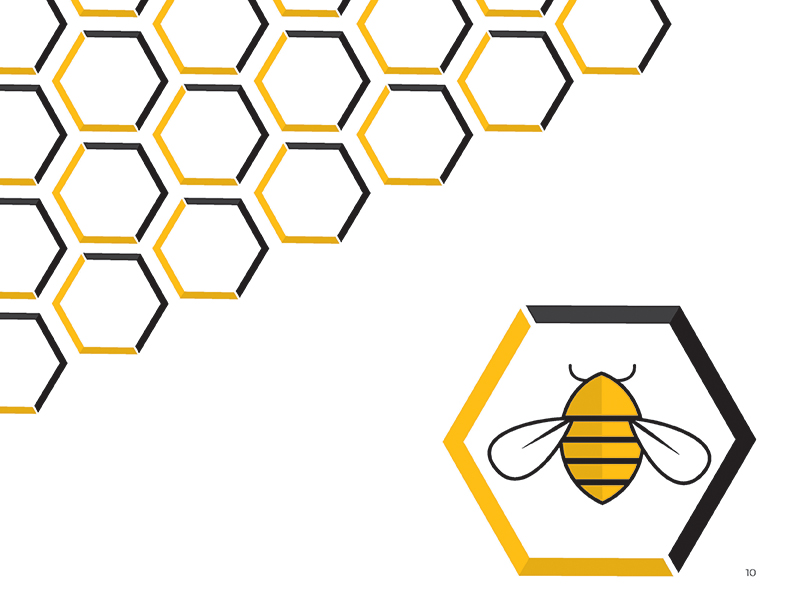
The two yellows found thorough out Bee Well’s branding represent the yellow associated with Honeybees. At the same time, black represents the strength that Bee Well strives to give their patients. The black color ensures all text is readable and can stand out. The fonts in both the logo and the website, Montserrat and Avenir, are easy-to-read with various weights to show contrast and hierarchy. The branding uses the hexagon from the center honeybee to create consistency and pattern. It is the simplest way to express the Bee Well Physical Therapy brand so that as soon as the viewer recognizes it, they will know it is
a part of the brand.
Color & Type Study

")
Sketches

Intial Concepts

Primary Logos
Secondary Logos
Brand identity Guidelines


Final Business and Appointment Card

Website

Visit the live website at beewellphysicaltherapy.com*
*This Website is not owned by me, so the original design might be changed
