Bridge the Gap Products
Package Design | Mouse, Flash Drive, and Ear Buds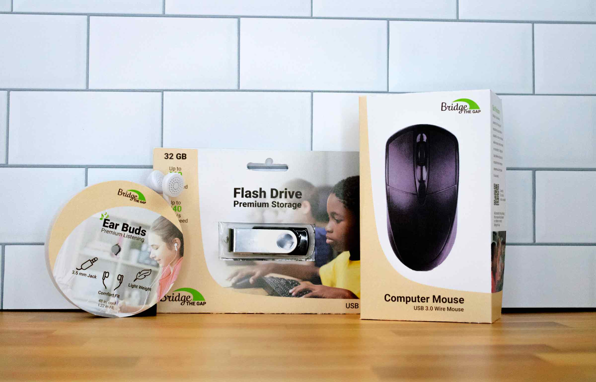
Bridge the Gap strives to give every child access to an excellent education. One way they can help is by offering tech products at low cost at their physical location in Walnut Creek, Ohio. Some products they offer are a 32 GB flash drive, Ear Buds, and a computer mouse. All these products are essential and will be able to help any children with school projects and assignments.
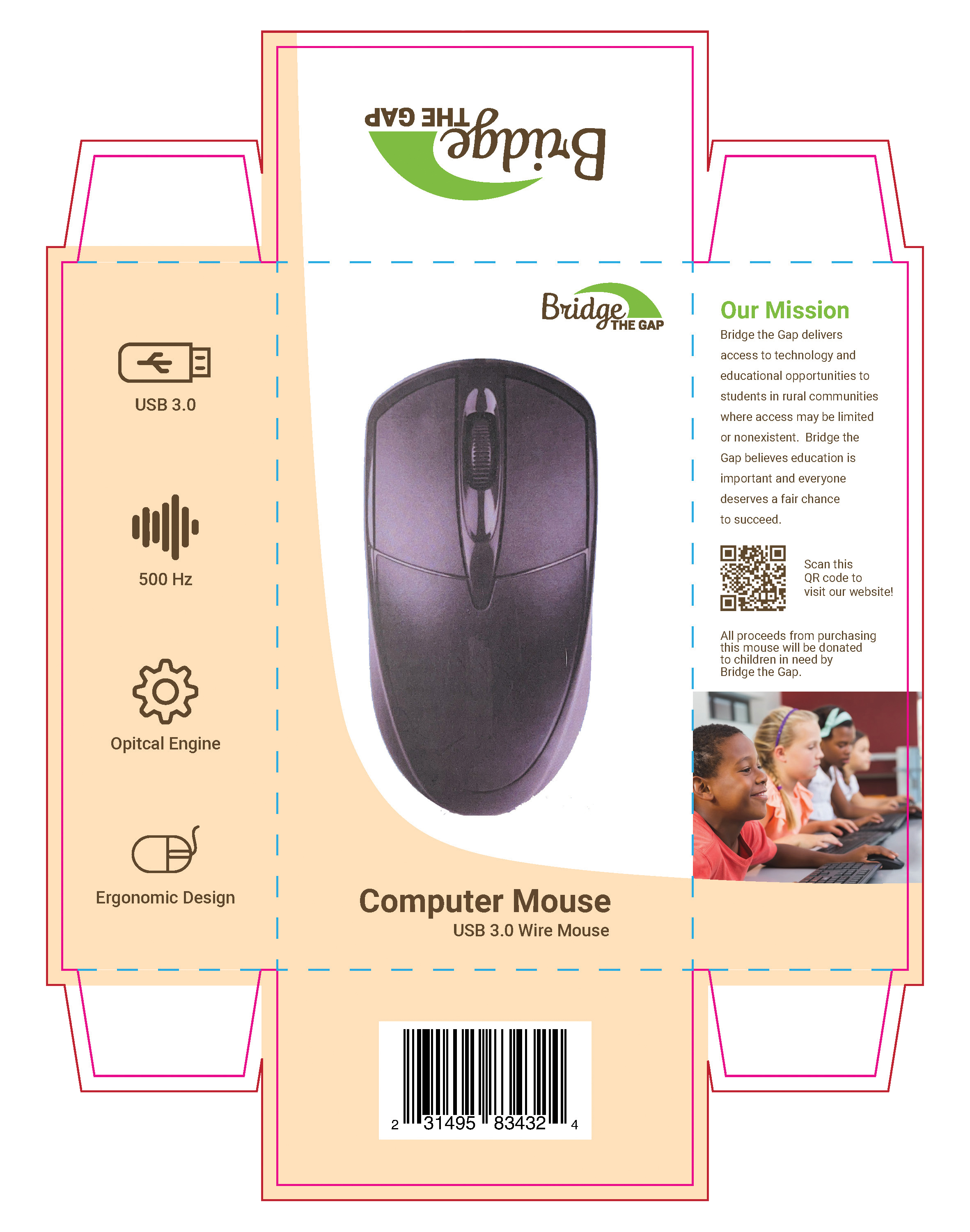
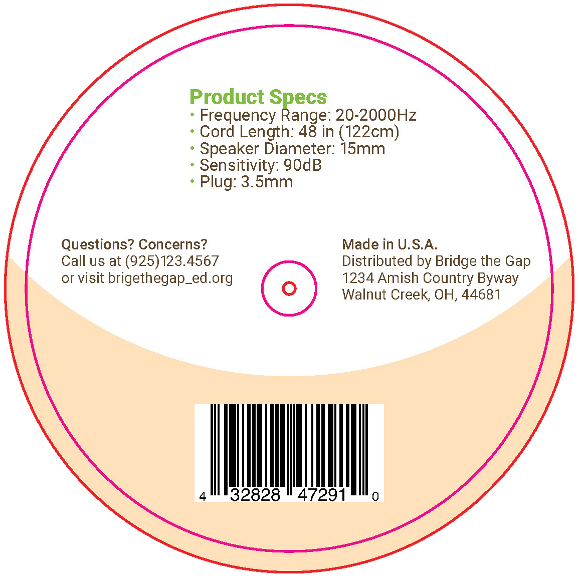
All the products feature a simple design for easy reading because of whitespace and contrast. Each item contains the complete branding of the Bridge the Gap. The full Bridge the Gap brand includes green, brown, and peach colors. Each package’s type treatments are in the font Roboto as well, as the packaging features the signature curve of Bridge the Gap found throughout the company’s branding. Each color represents an ideal or value that Bridge the Gap stands for, with green representing growth, brown expressing solidarity, reliability, and stability, and peach representing a feeling of encouragement. Roboto, the font found in all the packaging for each product, is an easy-to-read font so that the viewer can fully understand the products and their different features and specs. Every package contains the declaration of responsibility, country of origin, UPC, and declaration of quantity, which the law requires for all packaging.
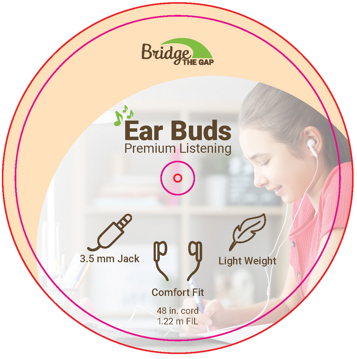
The premium listening earbuds feature icons representing each important specs a consumer might look for in earbuds. The image on the front of the packaging features a young teen girl representing one of Bridge the Gap’s target audiences. It also features the signature Bridge that Gap Curve is a common element throughout their branding. The packaging is a reuse storage device that can help the user transport the earbuds and an easy way to store them in a backpack or other school bag. The premium storage flash drive features the signature Bridge the Gap curve that helps divide the information for readability and the visual hierarchy of the design. The essential features of the flash drive on the front of the package with an image that, like the earbuds, represents one of Bridge the Gap’s target audiences. The package itself is to hang off the display shelf for easy visibility. The computer mouse packaging can be stacked easily on display for visibility purposes so the customer can easily see the product and the elements and specs of its features. The flash drive and mouse package feature Bridge the Gap’s impact on the community and local schools. All packaging is made for display-ready storage so the customer can understand each product and how they work.
The Final Flat Design of the Packaging


