
Strongsville Shock
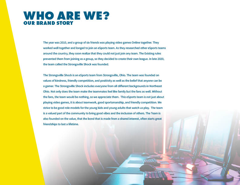
Branding | Logo and Identity SystemThe Strongsville Shock is an eSports team from Strongsville, Ohio. The team was founded on the values of kindness, friendly competition, positivity, and the belief that anyone can be a gamer. The team is a valued part of the community, bringing good vibes and including others. The team is also founded on the value that the bond made from a shared interest often starts great friendships that last a lifetime.
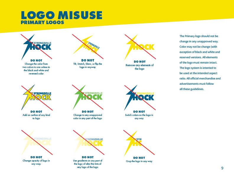
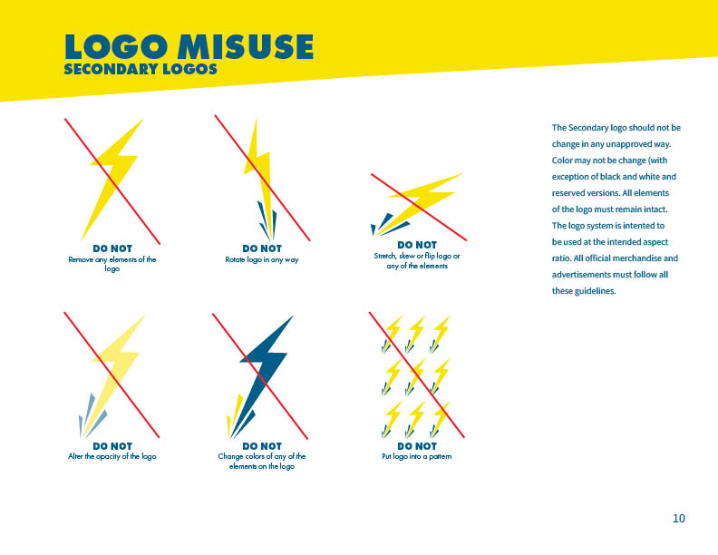
The logo represents the boldness and brightness of the team and its values. Electric Blue represents the pureness of the team, while Lighting Yellow represents the intensity and hyper-focus of this eSports team. The colors also represent the positivity and kindness the team was founded on initially. The typeface of Futura PT Bold represents the intensity and boldness of the team as well as the strong bond that is made when individuals make a friendship based on a shared interest. The second typeface of the logo, Source Sans Pro Bold, was chosen because of its various weights and the way it complements Futura PT Bold.
Color and Type Study

")
Sketches

Version One | Logos

Final Version | Logos
Brand Identity Guidelines


Initial Version | Identity System


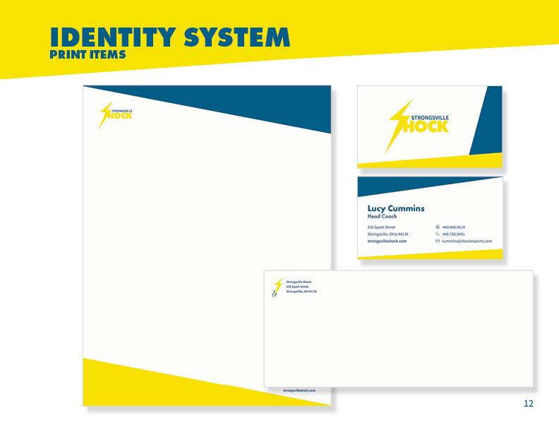
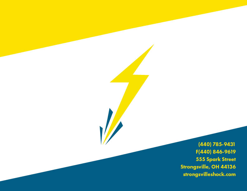
Final Version | Identity System
